Colors
A fearlessly rich palette
A designer who grew up amid the arid sands of the U.S. Southwest was perhaps bound to fall headlong for more vibrant hues. The vividness of Venetian art and interiors has long had an outsize influence on Roger’s work.


"No
timid
colors."
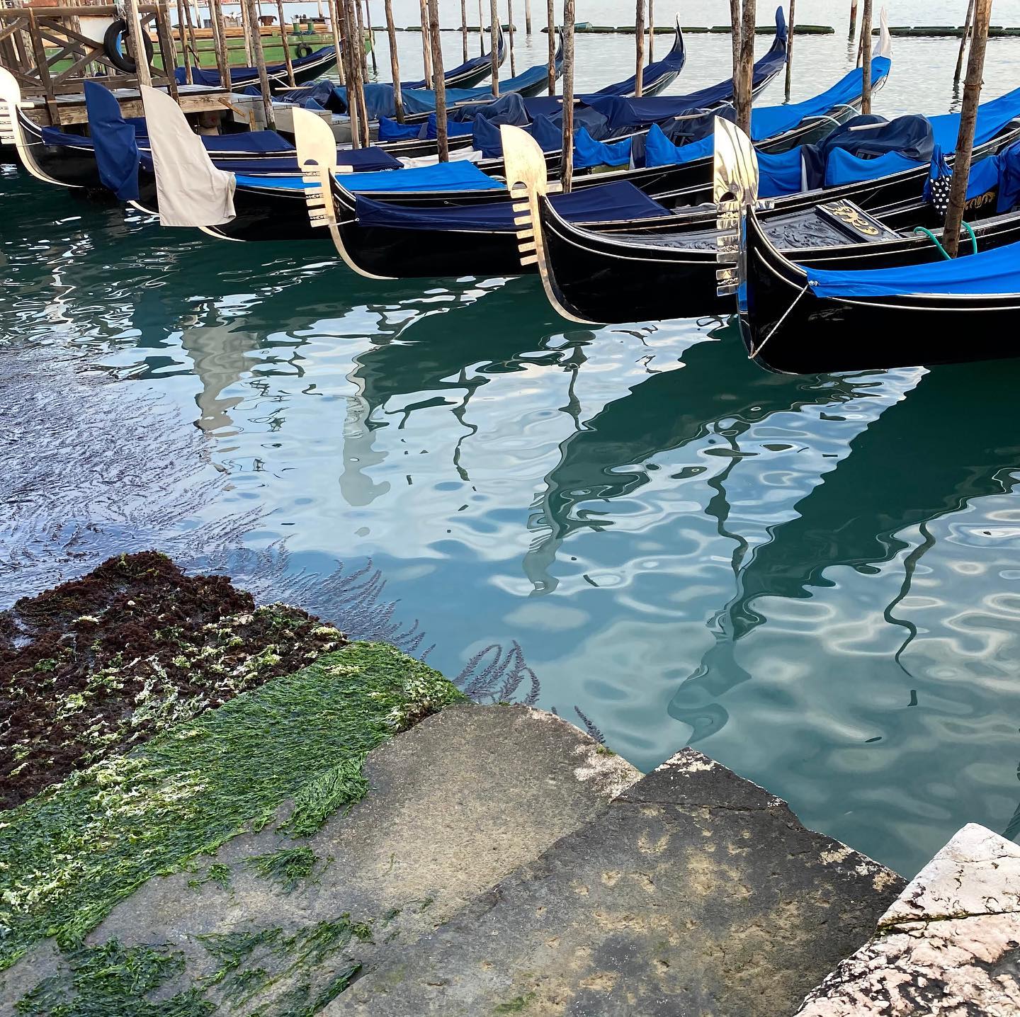
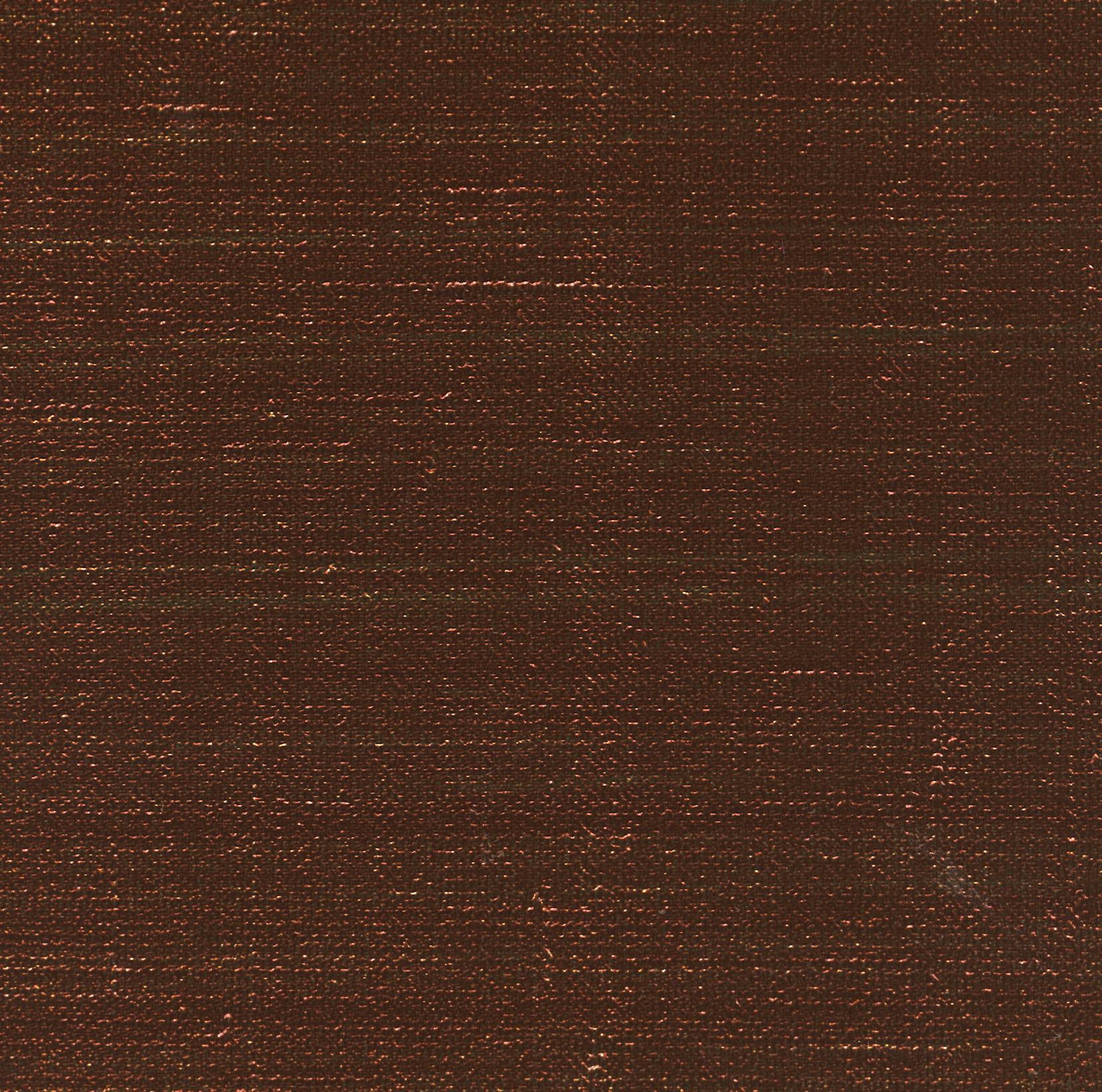
Modern Venice, still inspiring.
Colors of the Renaissance.
The richness of his choices early on could be somewhat startling in the hotel trade. “Hotel rooms are often painted in medium tones because they are the easiest to maintain,” he explained to Elle Decor in 2007. “Those are throwaway interiors.”
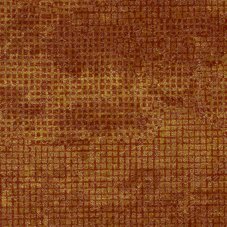
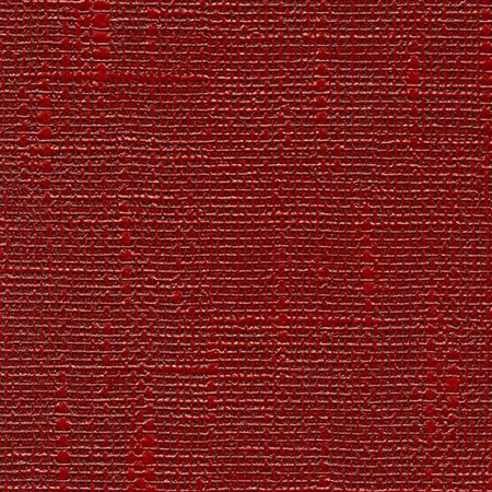
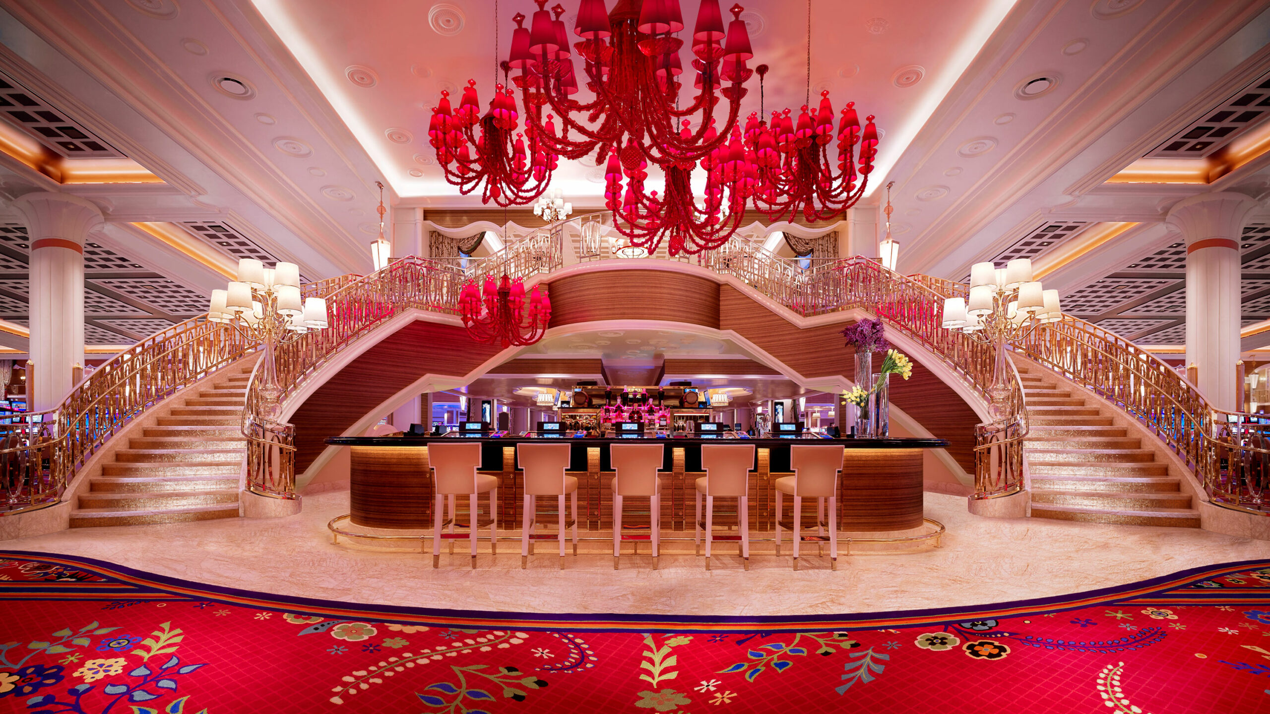
Brilliant red chandeliers became a signature flourish in his grand hotel designs.
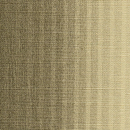
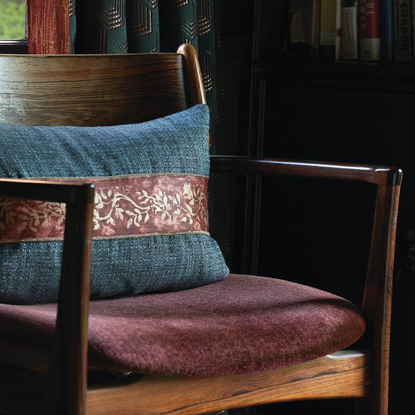
rich colors
Warm, welcoming, unforgettable.
“A key
harmonizing role
in the whole
ensemble of
effects."
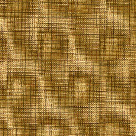
Mirroring the waters of Venice.
Flourishes of Italy.
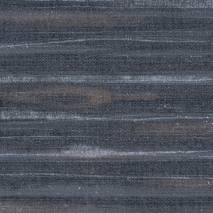
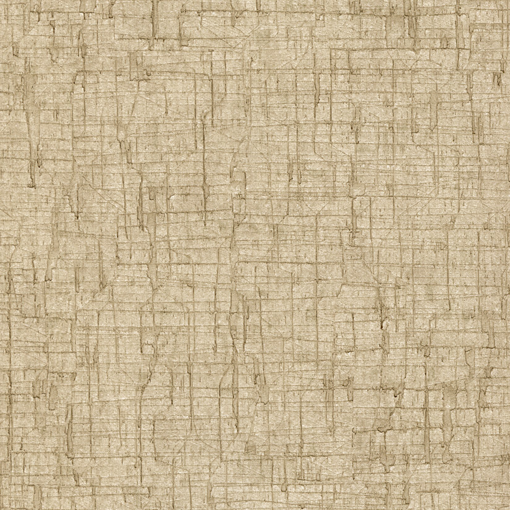
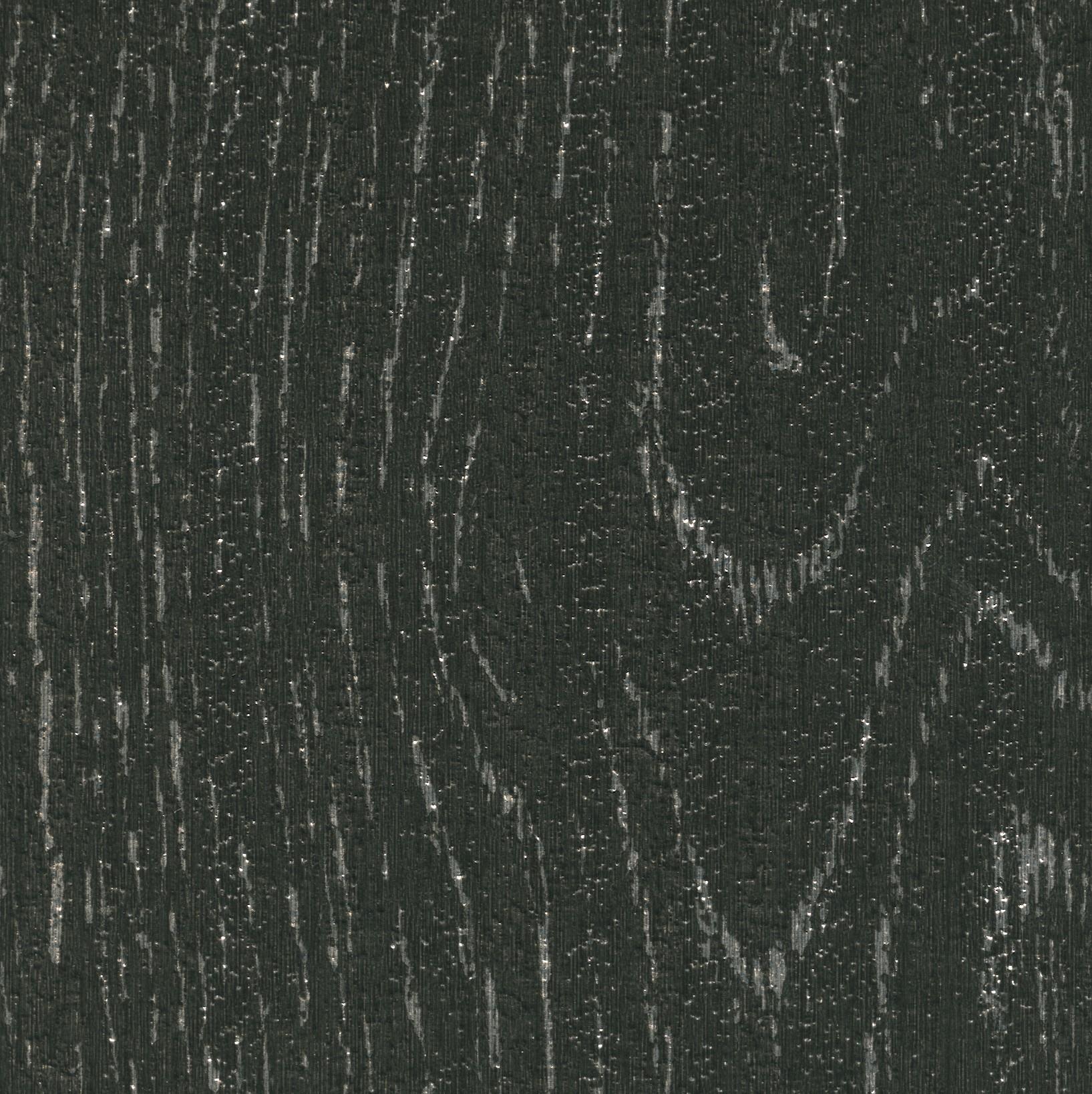
In design after design for wallcoverings, Roger has explored the interplay of innovative materials and colors. A recent design evokes the colors of the waters flowing by his Venice apartment.
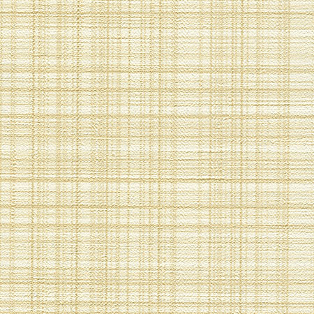
“All
whites
aren't
created
equal."
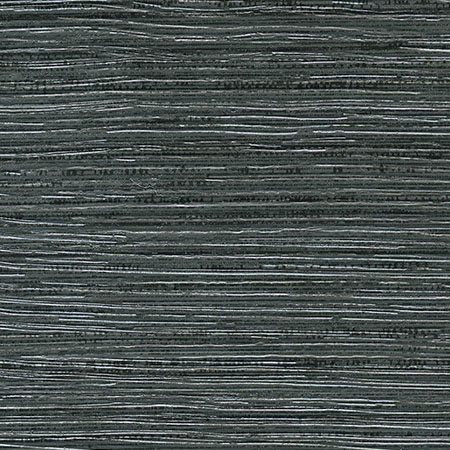
Striking patterns.